Creating a LaTeX Template for UT Tyler
Why you should use the LaTeX memoir class, in 5 minutes or less!

Because everyone needs more LaTeX in their life.
At least, the easy-to-use kind.
Most folks in STEM fields know about \(\LaTeX\). It's the gold standard for scientific writing, desktop publishing, and math typesetting. Its algorithms still beat MS Word's, Google Docs', or even Adobe's InDesign's. (If you haven't heard of \(\LaTeX\), it's a way to make PDFs with code.)
The website Overleaf.com is an easy-to-use experience for anyone who would rather sit down and write than fiddle with \(\LaTeX\) installation on, say, a Windows computer. Because of that, many thousands of students, academics, and professionals worldwide use it daily to typeset documents. The platform has a huge collection of templates, which can provide your document's formatting and looks.
The Problem
Half the problem is that most of the templates are boring, and only some are exceptional. Of course, any one you choose will produce a better document than MS Word would give you. The issue is that most users never tap into the superpowers of \(\LaTeX\). This is the fault of something called the "document class." A document class defines macros (shortcuts) for the user to set text with. The document classes everyone uses (article, book, &c.) are old, try to be as backwards-compatible as possible, and break easily if you try to be too cute.
Ask me how I know.
Anyway, for a new document, people should ideally be using the memoir class. It is a modern class (from 2001!) which is entirely dedicated to ergonomics. The original developer wanted users to create professional documents without knowing anything about typography. It provides a whole host of deeply integrated functionality that article and book can only dream of.
Side Note: The class has 400 pages of documentation, 500 pages in the user manual, and even comes with a 130 pages of typographical notes by the developer. You will not lack for help resources if you adopt memoir.
Having a general overabundance of okay-ish templates wouldn't be a problem on its own. The other half of the problem is that many universities provide \(\LaTeX\) templates, while mine does not! So, can we create a decent template using memoir that fixes UT Tyler's lack of an Overleaf template?
The Solution
We have a default article document that looks like this:
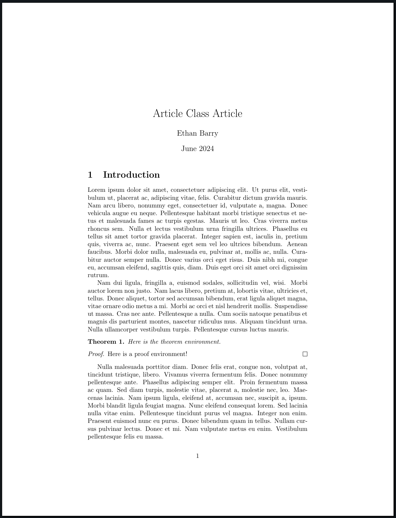
But, we want to turn it into something pretty. If we simply change from article to memoir as our document class, very little happens. We need to do more. I'll walk through the changes I made, and a beginner-level \(\LaTeX\) user should have no problem following along in the code, available here.
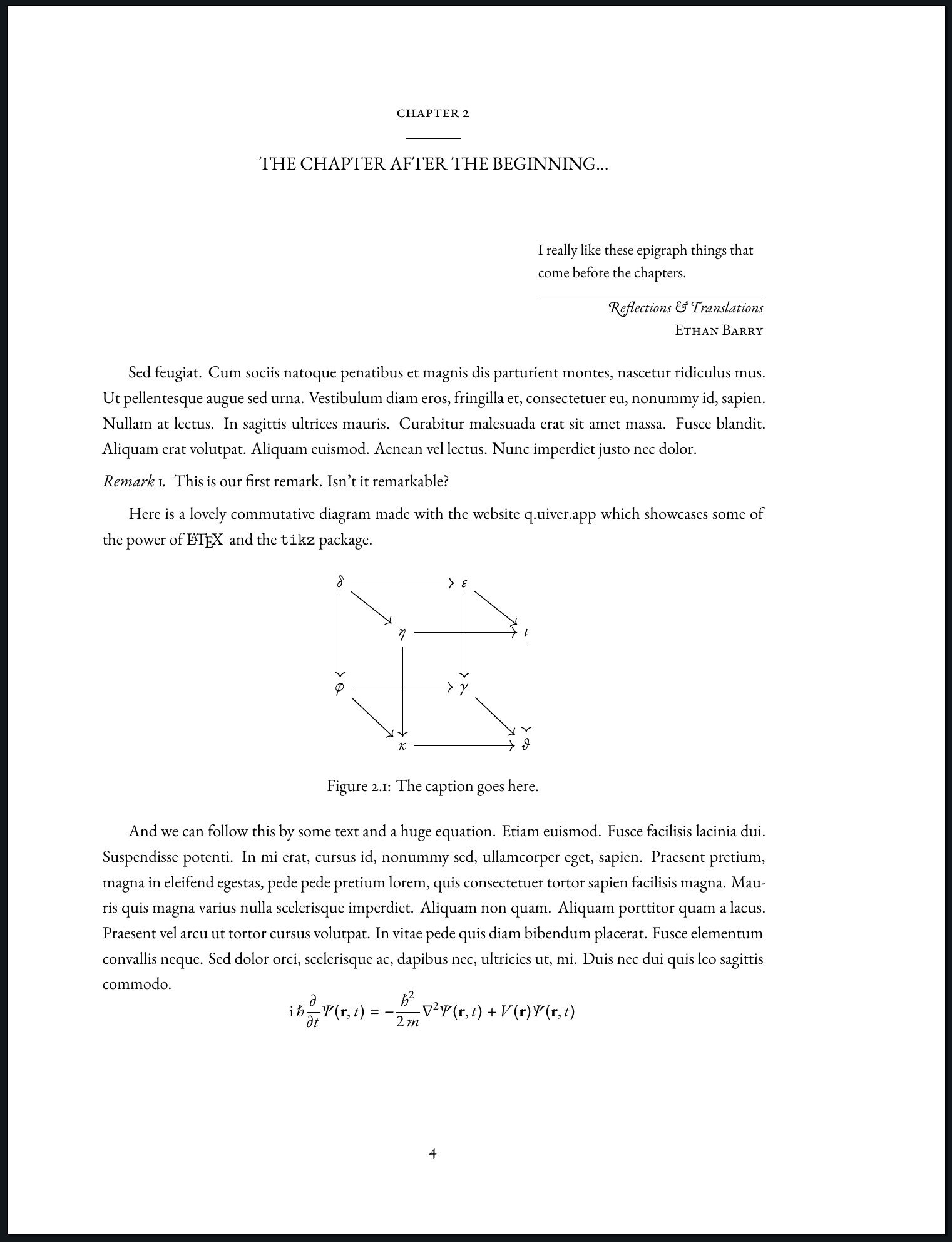
Here is a page from the final result:
So, what changed?
Visible Changes
First, the font. There's nothing wrong with the default latin-modern font, but it is a bit spindly at larger sizes, and we want something classic. You'll find there is no better option than EB Garamond. If you haven't overridden my CSS, this blog is set in EB Garamond as well. You can insert \usepackage{ebgaramond} to set it as the main font. I've included a package that sets it as the math font, too. Notice how nice the Schrödinger equation looks!
Second, the margins are different—I used a wider right margin so I can insert margin notes—which gives the document a more book-like feel. I want to use margin notes to introduce variables. I saw this done in an older journal, and I think it's a very handy idea. It's a shame we don't see it more often. Notice how \(x\) and \(z\) are shown below. If you were skimming the paper for some variable's definition, you could easily find it!
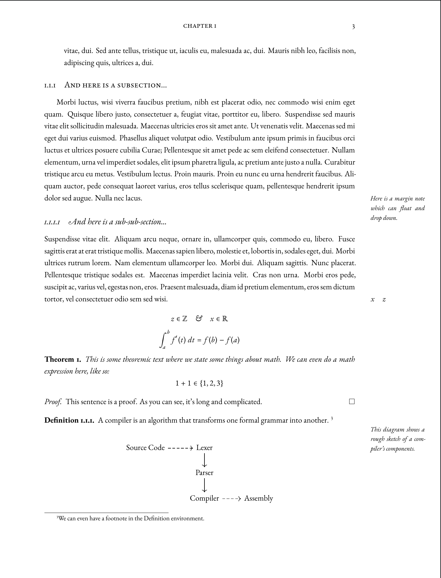
Boldface is used sparingly, with italics and smallcaps (\scshape) providing most of the emphasis. Bold faces are not a major element of classic typography, so it's nice to minimize their use. It goes a long way to making the document more readable.
Finally, my favorite part is the title page and frontmatter. I'll let the images speak for themselves.
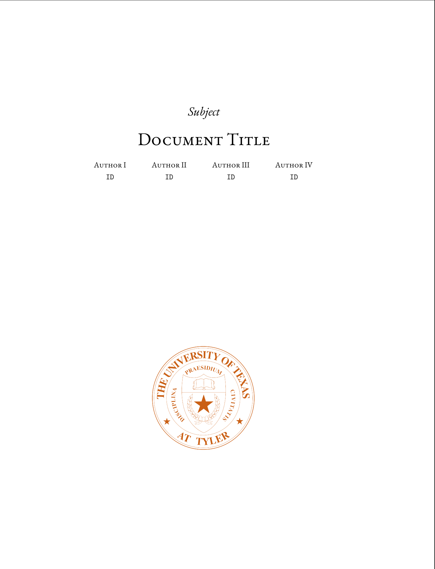
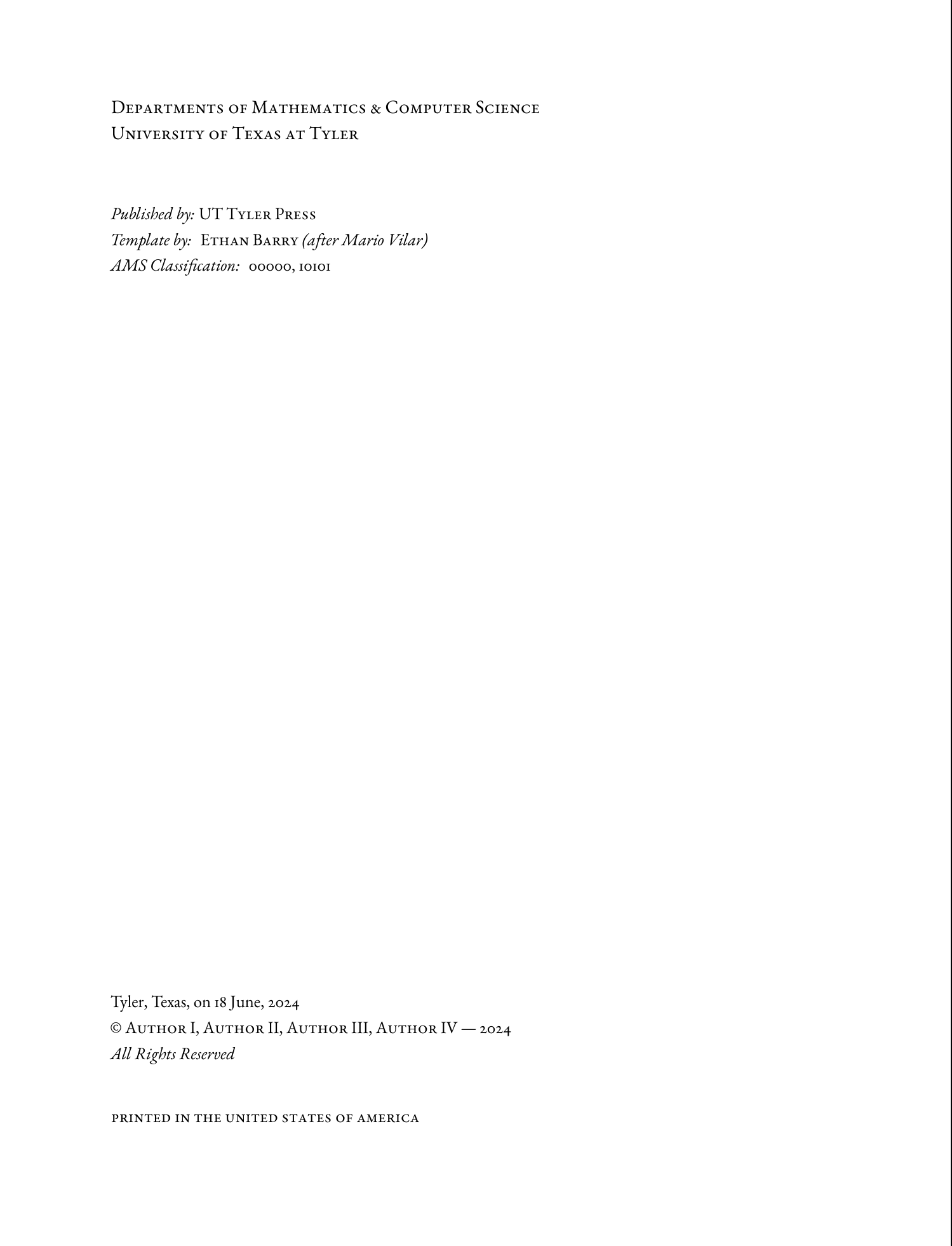
The title page is inspired by this template by Mario Vilar on Overleaf, though I didn't use any code from it in this document. I especially like his faint background. It's similar to my research paper's title page here.
Changes "Under the Hood"
The code itself is fanatically organized and heavily commented. I want it to be as easy as possible to do whatever needs to be done. It has sane defaults for document divisions and page styles, with most of the options visible in the preamble.
You can explore it for yourself on GitHub or Overleaf.
Conclusion
I am excited to see whether this gets any notice on Overleaf from my fellow students, but regardless of whether it does, I want to use it for my own papers. Hopefully none of the professors will be too draconian about formatting rules in the coming semesters.
As for extensions to the template, I'm adding some macros for margin notes and variables in the margins. I realized after I took the screenshots that the margin notes should be set \raggedright instead of justified. I think a macro that takes the note as an argument and automatically formats it will be useful.
As always, please send me any feedback you have at ethan.barry@howdytx.technology, or drop me a message on LinkedIn!